THE BRAND AUDIT
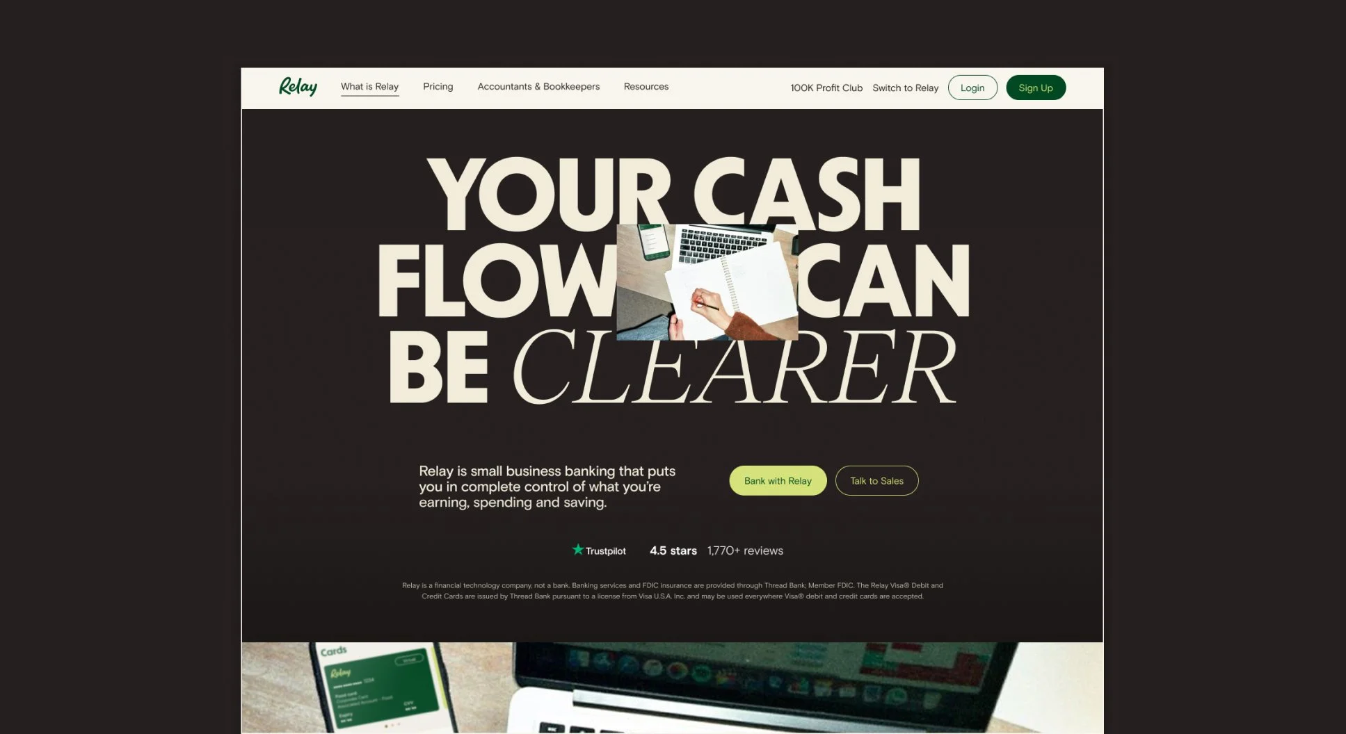
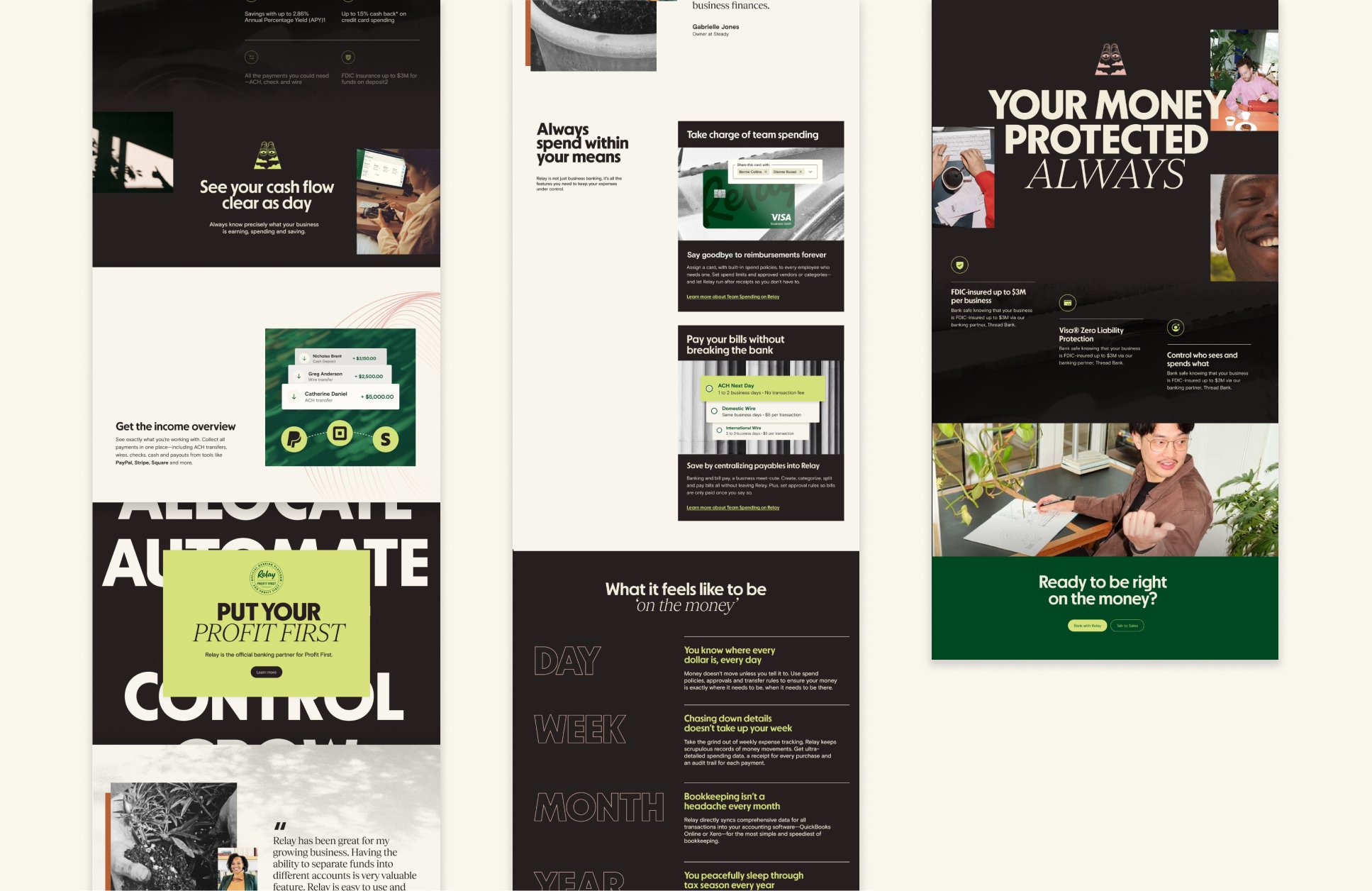
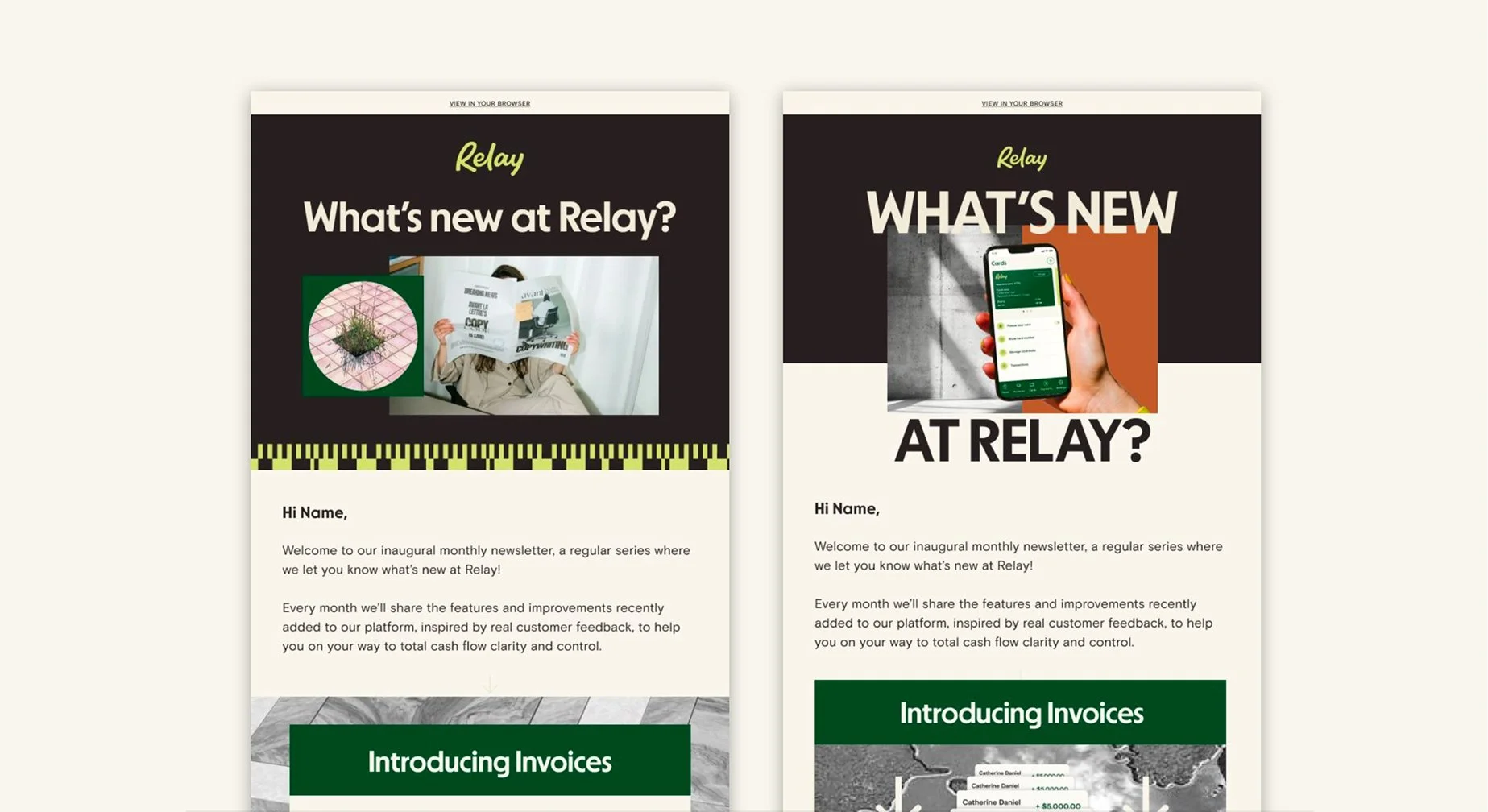
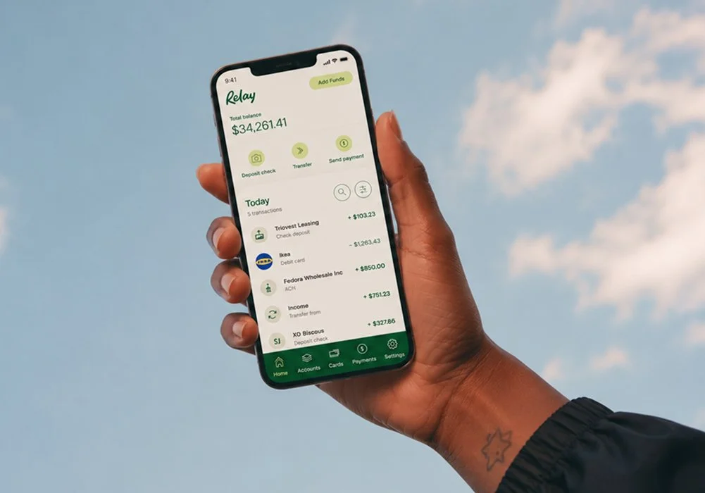
Relay asked me to evaluate the strengths of its existing visual identity and identify where it had room to grow. Starting with a comprehensive audit, I developed a strategic framework and visual direction for a more cohesive, scalable brand system.
ROLE
Brand Strategy
Creative Direction
TIMELINE
2 months
DELIVERABLES
Comprehensive Brand Audit
Recommendations & Visual Explorations
01 THE CHALLENGE
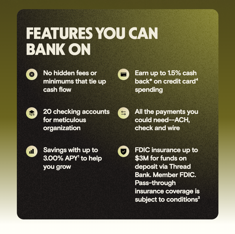
As Relay evolved, the brand system started to reveal a handful of inconsistencies and opportunities for refinement.




02 THE AUDIT
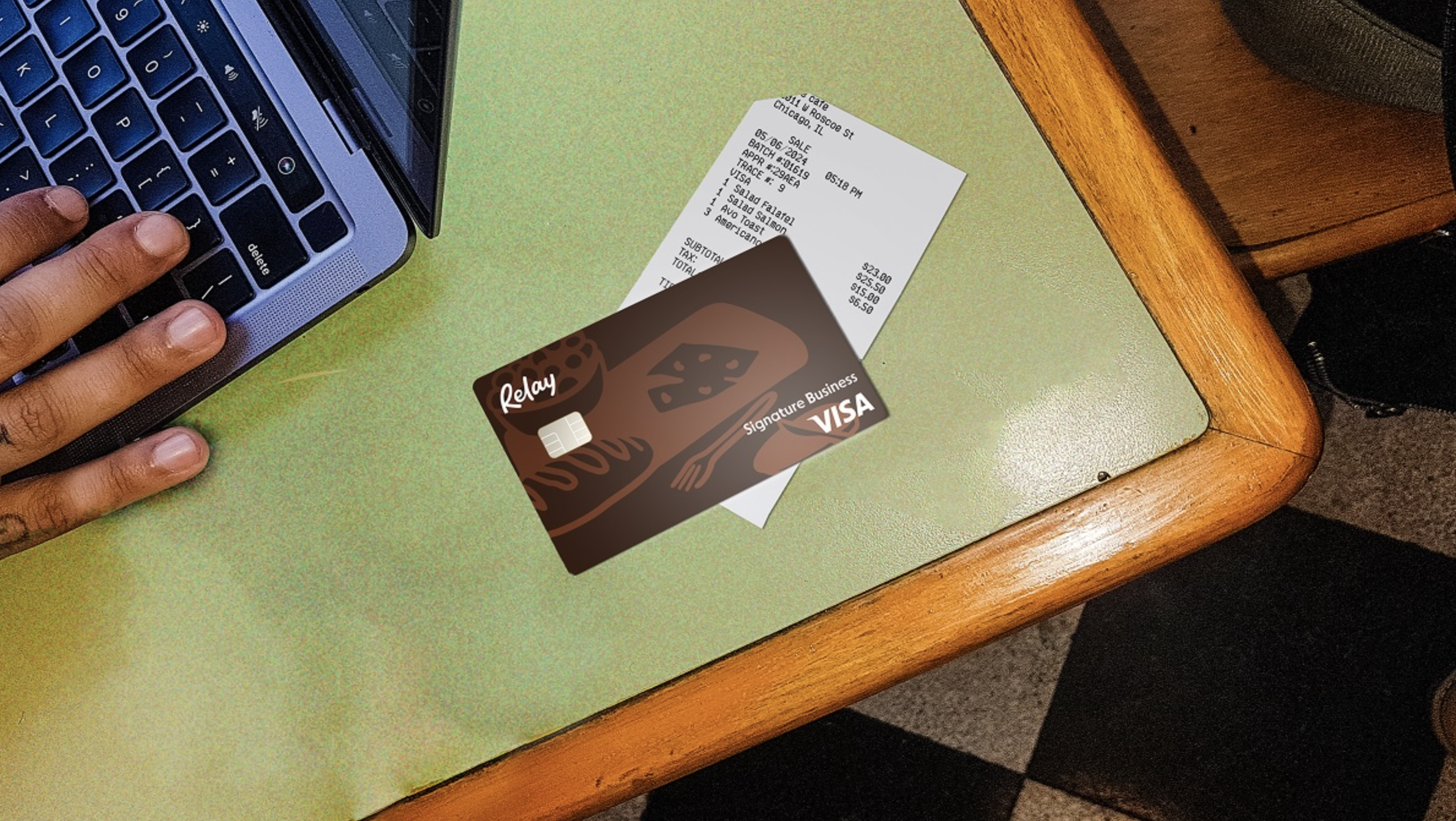
Rather than redesigning assets one by one, I audited the full visual system to see where it could be simplified and strengthened.

PHOTO BALANCE
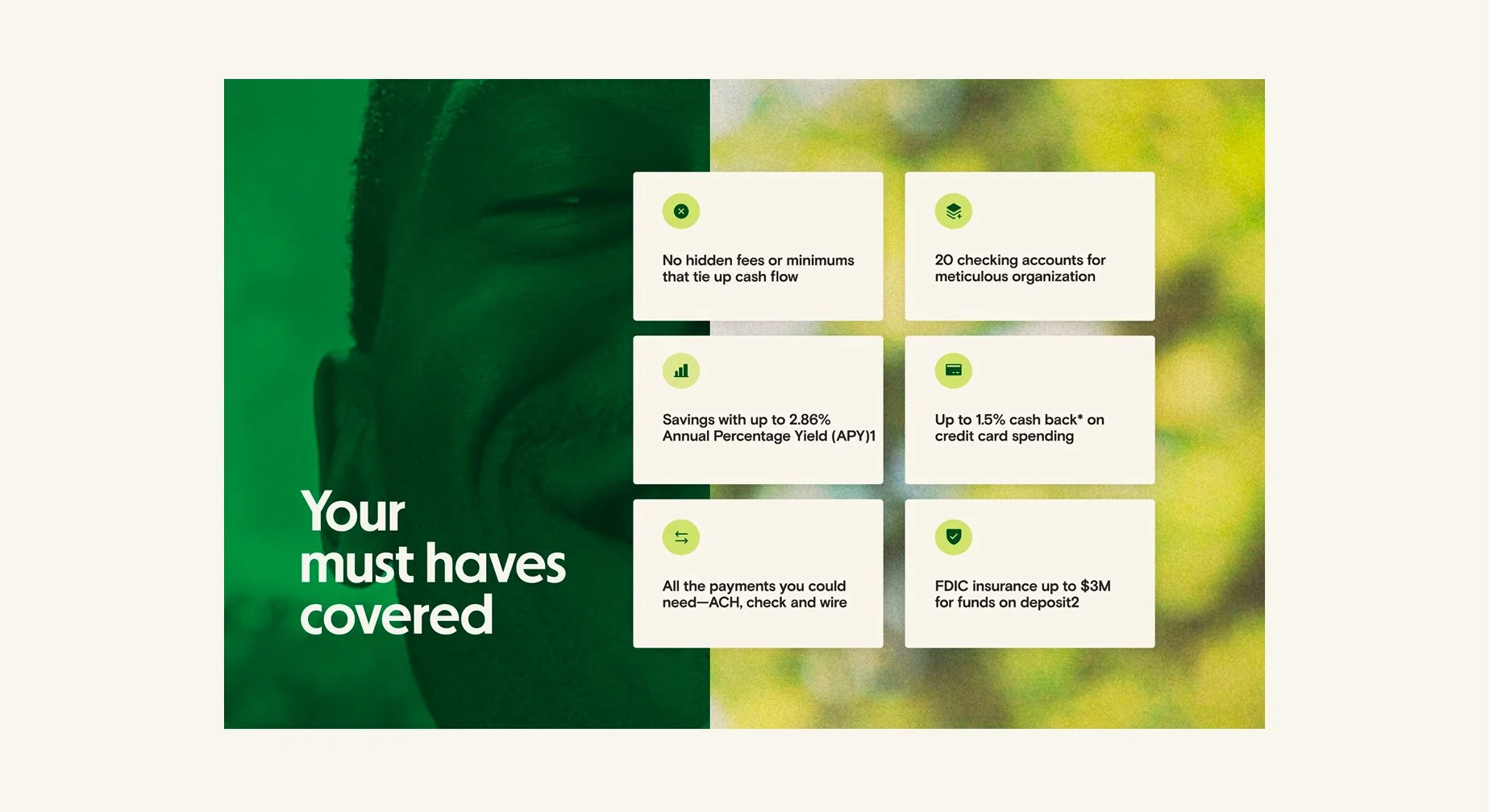
Reduce photo density to strengthen individual imagery and create room for a more distinctive visual system.

Type Hierarchy
Move beyond a single bold weight to create a typographic system with greater contrast and flexibility.

REDUCE VISUAL NOISE
Build depth with imagery, contrast, and color instead of relying on gradients and textures.

SCALEABLE SYSTEM
Introduce a broader range of elements that make the brand more expressive, cohesive, and scalable.
03 RECOMMENDATIONS

Establish a stronger typographic system
Introduce a more expressive typographic system through stronger hierarchy, varied type treatments, and a complementary serif typeface.
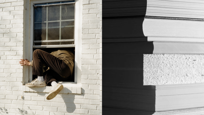
Make photography more intentional
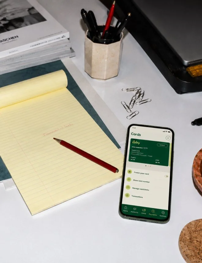
Shift away from generic stock imagery toward a more curated photography style that creates emotion, supports the narrative, and gives the brand a stronger point of view.

Expand the visual vocabulary
Build a more recognizable brand by introducing a richer system of illustration, iconography, and supporting graphic elements that can scale across every touchpoint.
04 INSPIRATION

CLASSIC BANK ORNAMENTATION
Modern patterns rooted in classic architectural details.
MATERIALS & SuRFACE TEXTURES
Ground the brand in the everyday scenes of running a small business.

AMBIGUOUS VIGNETTES
Replace predictable imagery with more evocative moments that invite curiosity.
05 EXPLORATIONS